Q: How did you first get into graphic design and how did it lead you to working for the Union Hotels?
Visual communications was my subject of studies when I was at college. I have always been a creative thought. I never limit myself only to design. I practice body and face painting too, as well as painting on walls, sewing of special-edition sketchbooks, illustration and even occasional lecturing. I love the interdisciplinary approach to things and if I can attach some deeper psychological meaning to my projects, all the better.
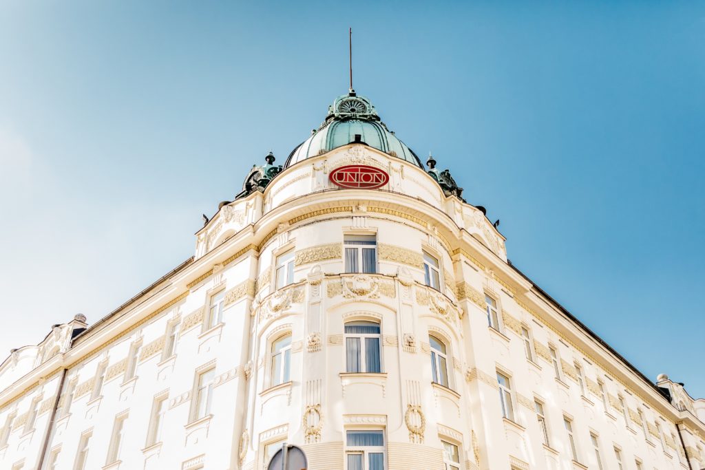
I got invited to Union Hotels through an acquaintance of mine, so a long history of networking finally paid off. I was very excited to get the opportunity. Back then it was a kind of a dream to work in a field that offers such a broad range of projects, from guest room graphic materials to F&B outlet menus and special offers, to conference materials and advertising, and let’s not forget the entire digital realm of materials and the hotel and garage signage … the list is truly endless and extremely diverse.
Q: What kind of things are on your inspiration board while designing for Union Hotels?
There is actually just one small postcard with the words “Vsemu bom kos” (“I can handle everything”). It is an often needed booster because things tend to get so hectic that you need to keep a calm mind. So my spartan inspiration board is actually a counterweight to the daily workings of the Union Hotels. Exactly what I need.
Q: How is designing for a hotel chain different than designing for anything else?
It is an enormous system, and the visuals are supposed to connect through an endless field of topics and materials. So it is a challenge to maintain a uniform visual language that defines the entire business even through sometimes contradictory topics. It is easy to get caught in some individual little project and make a smashing and fresh design, because you “just got this amazing new idea”, but this way the corporate approach can quickly end up in jeopardy. It is my daily obligation to concentrate on the big picture.
Q: Please describe your creative process. What are the major steps?
A brief is the pillar of good outcomes. First, a firm understanding of what the objectives are is required. After that it is brainstorming time, the first concepts, testing, development, more testing and finishing the design. But this is how it happens in ideal circumstances. The pace in our company is so fast that, more often than not, we simply cannot afford the luxury of time, to work in such a way. So we have to be extremely agile and resort to past experiences and intuition to pull things off. But we got quite efficient in this style of working, so most of the time the outcomes are positive.
Q: How do you measure the success of your design?
If it is done well, nobody will notice it [laughs]. Because you will not be stressed while engaging with it. And such designs tend to have a longer lifespan than others that are later subjected to the scrutiny of endless corrections. All the information should be presented as clearly and as straightforward as possible because of a very broad spectrum of the target audience. But every now and then a client, a superior or a colleague will let me know directly of the benefits brought by my designs. I have some good memories of such acknowledgments. They are very dear to me.
Q: What brands do you admire most and how do they influence your work?
I admire every brand that is fully conscious of who they are, and that manages to communicate this message consistently through different media and through time. I also admire the way these brands tackle the task of reinventing themselves through development. Apple, McDonalds, L’Occitane, Coca Cola and our own Slovenian Cockta. But these are only some of the big and well-known ones. There are many smaller firms and businesses that catch my eye as well. I am always on the lookout. It is automatic and comes with the profession, I guess.
These brands serve as an occasional inspiration. I try to remember the good practices of these players when I have room to push a design forward or when I need to develop something new. But the general layout of our visual identity is quite firmly set, so it is usually more a task of executing the visuals “by the book”. However, in 2018 our company is going to re-establish the vision and strategy of the Union Hotels and also of each individual hotel. This will also include a reinvention of our hotel brands in some way. The extent of the changes is yet to be revealed, but it is definitely something to look forward to.
Q: Do you stay abreast of the latest design trends?
2018 is going to be anything but boring. Designers are going out of their way to create eye-popping effects with a myriad of different approaches and techniques. Colourful, mesmerizing, remarkable.
Q: What is the design piece from your portfolio that you are most proud of?
Oh, this would be something quite unique. It is a small and special illustrated booklet carefully designed to offer consolation to children who have suffered the traumatic loss of a parent. It is a sweet story written by child psychologist Dr Christof Lehmann entitled The Little Sunbeam and the Family Rabbit (Mala Sončna Žarkica in zajčja družina. Publisher: Ozara Slovenija).
Why is it special? Because this was one of the rare occasions where the illustrator was also the designer, the typographer and the researcher. By implementing this holistic approach, some innovative solutions were possible that are usually not pursued. Every stroke, every letter is in its specific place for a reason. A child doesn’t yet have the perception of passing time. So the whole experience of engaging with this book is a journey in itself. It works as a narration through time on a very intuitive level, where a child can safely travel from the darkest moments of our existence to a brighter and lighter tomorrow. Even the materials have been chosen in a way that makes the booklet seem kind of ethereal and unusually weightless. More like a spirit than an object. It represents Existence. It is my masterpiece.
Prepared by: Ajda Borak


